Armonk-Somers Podiatry: from brochure site to a real patient portal
Dr. John M. O'Hanlon, DPM had a basic brochure site - hours, address, a phone number. We rebuilt it as a working patient portal: booking, billing, intake, insurance, FAQs, a safeguarded AI assistant, and a direct async channel to the doctor.
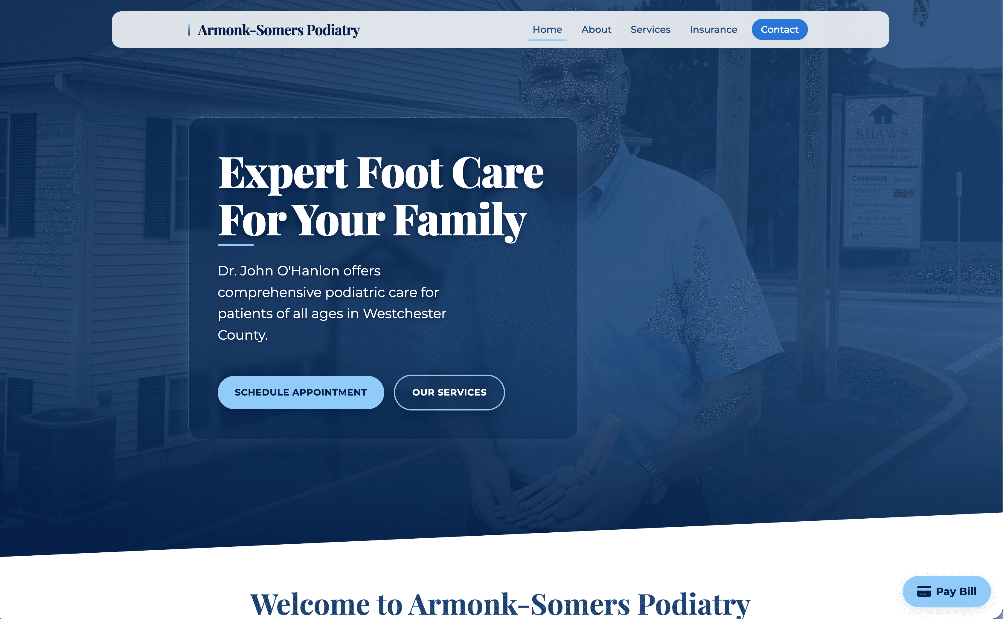
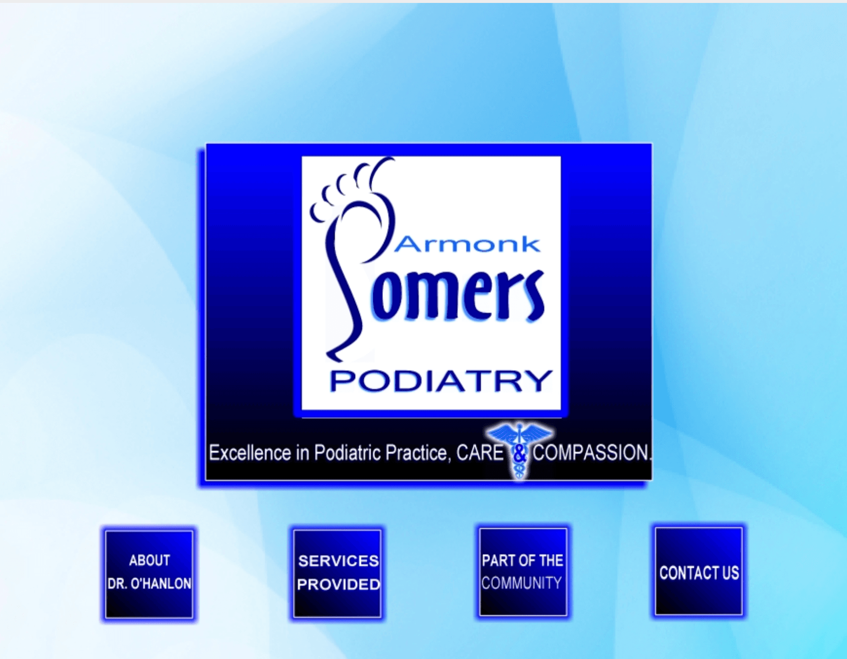
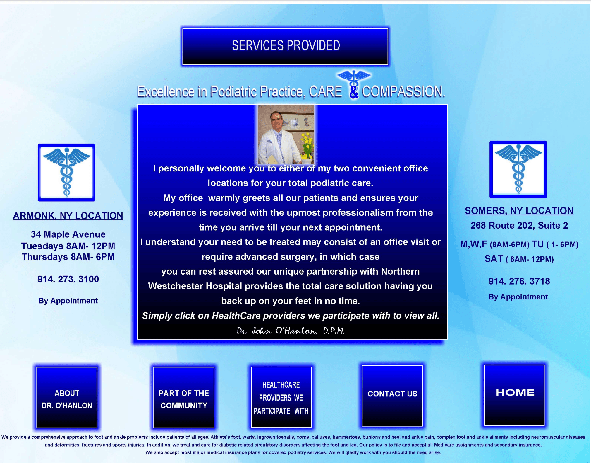
John M. O'Hanlon, DPM runs Armonk-Somers Podiatry across two Westchester locations — Armonk and Somers, NY. The practice was already well-established, well-reviewed, and well-run. What it lacked was a digital front door that did anything useful. The previous site was a brochure: hours, address, a phone number, a short bio. Anything a patient actually needed to do still routed through the front desk.
For a small specialty practice, that gap is expensive in ways that don't show up on a P&L. Every routine question — what insurance you take, what to bring to a first visit, whether a particular condition is something you treat — consumed front-desk time during clinic hours. Patients who wanted to ask the doctor a quick question had no way to do it without calling. New patients had no way to start the relationship before walking in the door.
One custom site, every patient touchpoint.
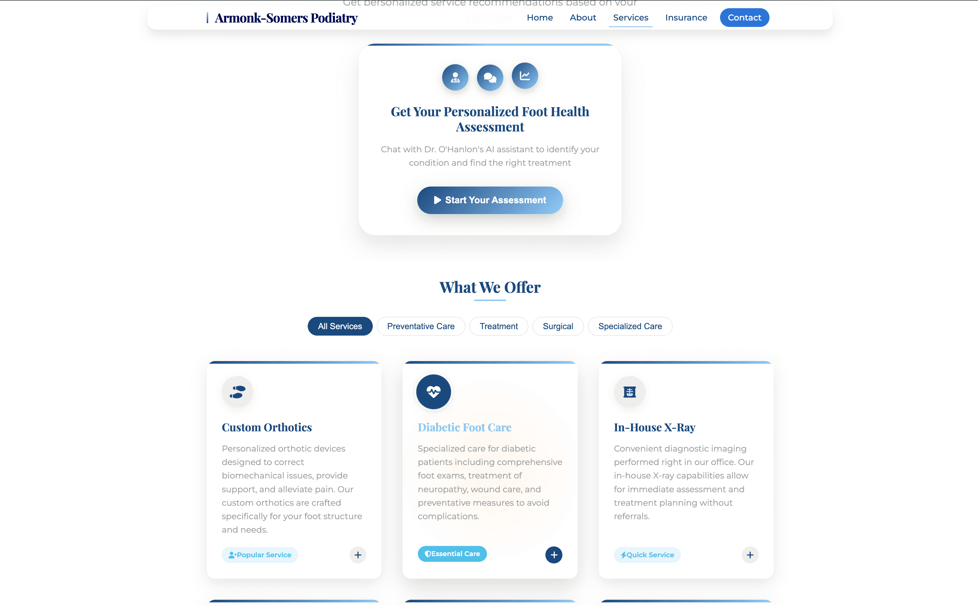
Rather than stitch together five off-the-shelf tools that each charge per seat and behave differently, we built a single custom site for the practice. Patients now have one place to view services and FAQs, sign up as a new patient, complete intake digitally, check insurance details, book appointments, pay bills online, and message the office — including a direct asynchronous channel to the doctor.
Each of those used to be a phone call or a separate in-person step. Now they happen on the patient's schedule, on their phone, and the practice still owns the data and the experience end-to-end.
Safeguarded AI — not a generic chatbot.
The AI assistant on the live site is the part most practices get wrong. A generic chatbot in a medical context is a liability: it will happily speculate about symptoms, recommend treatments it shouldn't, or confidently misstate office policy. We built this one differently.
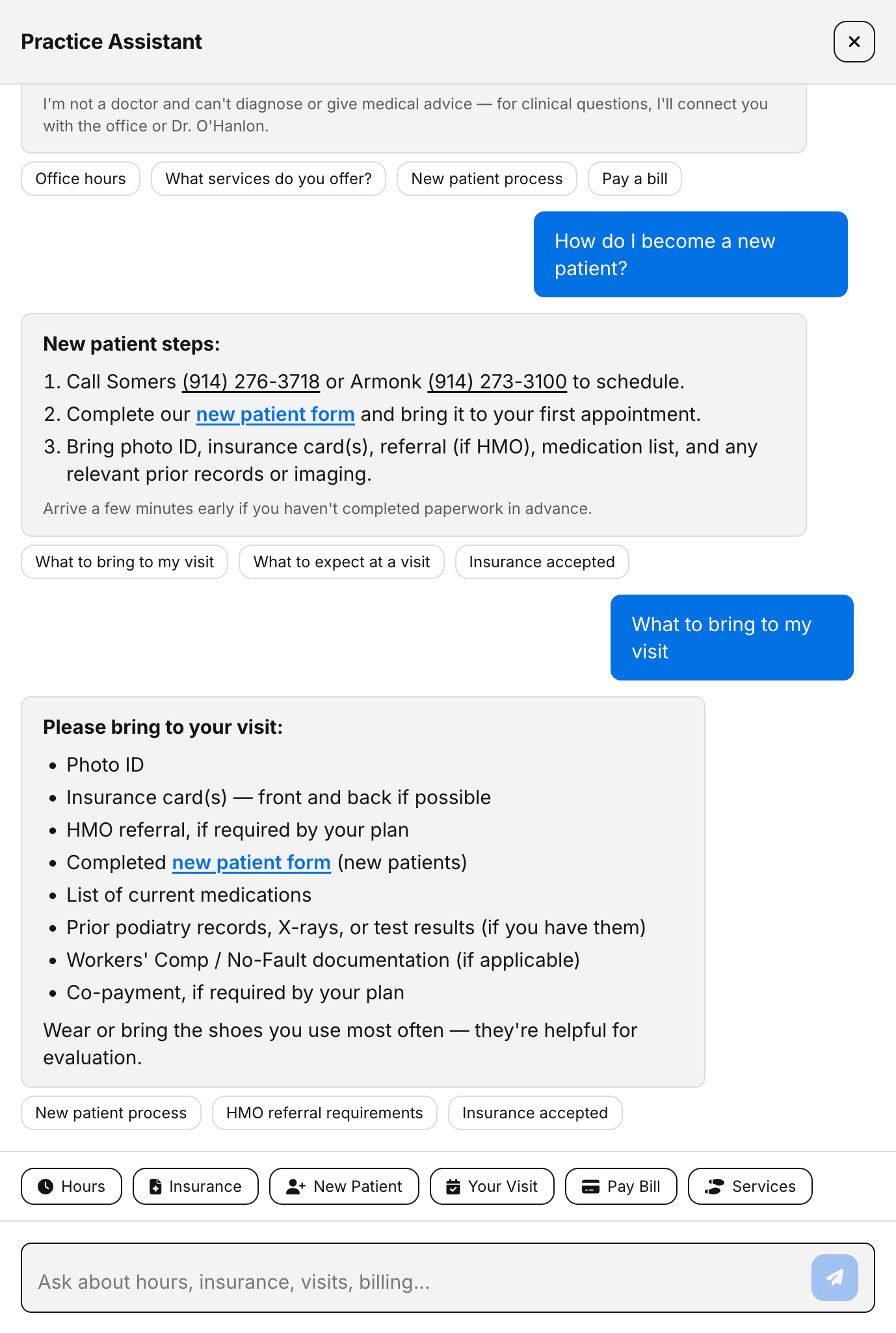
The assistant is tightly scoped to what the practice actually wants it to handle — logistics, hours, services offered, insurance questions, what to expect at a visit, how to prepare, how to pay a bill, how to start the new-patient process. It does not give medical advice, it does not diagnose, and anything outside its lane is routed to the doctor or the office instead of guessed at.
In a medical practice, the most important thing an AI assistant can do is know when to stop talking and hand off to a human.
A direct line to the doctor — without burning the doctor out.
The site also gives patients an asynchronous way to ask the doctor a question directly. The AI handles what it should handle. The office handles what the office should handle. Anything that genuinely needs the doctor reaches the doctor in a structured, reviewable queue — not as another interrupting phone call during a clinic day.
That separation is what makes the system sustainable. The doctor stays accessible without staying on call for every routine question, and patients get a clear, honest picture of what the form is for.
Billing and insurance stop being a phone call.
Online bill pay was, on its own, an immediate operational win. Bills that previously got settled at the next visit are now handled from a phone in a few taps. Digital intake means new patients arrive ready to be seen instead of starting their visit on a clipboard. And insurance — previously a phone call to the front desk — is now a self-serve answer.
Routine patient questions
Phone-first answers vs. site-first resolution
These are not flashy AI features. They are the unglamorous workflow fixes that small practices usually never get around to building, because the off-the-shelf options are expensive, generic, or both. Custom software made them affordable.
Early signal: more views, more new patients.
The lift isn't only the new portal. We rebuilt the Google Business Profile from the ground up and tuned the on-site SEO so both Maps discovery and organic search pull in qualified traffic, then the portal gives those visitors something to actually do once they land.
Taken together, everything is pulling roughly 2× the views the previous brochure setup was getting. That uplift isn't only existing patients looping back for bill-pay and booking - we're seeing a noticeably larger slice of cold impressions and net-new eyeballs in analytics, alongside the predictable return visits from portal tasks.
Impressions vs. timeline
Brochure era vs. searchable presence
The downstream effect is what matters most: new-patient signups now come in directly through the site, instead of routing through the front-desk phone line. That was effectively zero on the old brochure site - and SEO plus a stronger Maps presence make it easier for people who have never interacted with the practice to find their way into that funnel in the first place.
The result: a small practice that runs like a modern one.
The practice is still small, still personal, and still run by Dr. O'Hanlon. What changed is the surface patients interact with. Booking, billing, intake, insurance, FAQs, AI-handled logistics, and direct messaging to the doctor now all live in one place that the practice owns — built specifically for how this practice actually works, not bolted together from someone else's assumptions. See it live at somerspodiatry.com.
Outgrown your brochure site?
We build custom patient-facing software that respects the way your practice actually runs - including AI that is tightly scoped, safeguarded, and never freelancing medical advice.